 Sarah Wyman Whitman and the Art of the Book
Whitman may be regarded as the first true artist-designer in America’s book industry. She revolutionized trade bookbinding by popularizing simple, spare designs created largely around a distinctive calligraphic lettering that is deliberately uneven and rustic. Many of her groundbreaking and most successful designs are based largely, or entirely, on lettering. She wrote that one of her teachers, the French master, Thomas Couture, said that “letters were the most beautiful embroidery in the world because it was an embroidery that spoke” and then added, “ To any one who learns to love it, it is the enduring pleasure to decorate by letters.” Notes of an Informal Talk on Book Illustration…Given before the Boston Art Students Association, Feb. 14, 1895, p. 10. She was the first to design her own distinctive alphabet which was immediately identifiable as hers.
 Whitman’s letters A, C, E, G, and S can be our diagnostic. In the informal hand, the A is like that used by the German Renaissance artist Albrecht Dürer, with a crossbar top. E is mostly a shallow epsilon, though the early letters are nearly C-shaped. The center bar often ends with a trumpet-shaped serif. G is a sort of vortex whose uppermost end sometimes points slightly upward; S ranges in appearance from two labored C shapes to a sleek angled slash that extends below the writing line. In the formal style, look for the usually rather small but sharp serifs. The bowl of the P and R sits high on the vertical stroke and often extends out relatively far; the angle of the descender of the R is shallow and often starts fairly far out on the bowl. The N and M are sometimes very wide, and the middle bar of the E is often longer than the top bar. V is often substituted for U. All her letters are hand drawn and the careful observer will note slight variations between repeats. Dots are often used to separate words.
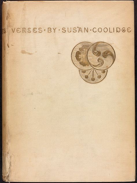
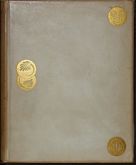
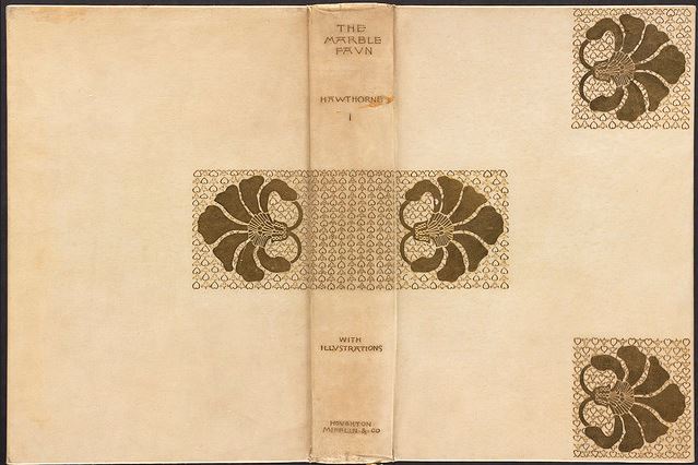
Whitman’s design for Verses by Sarah Chauncey Woolsey, under her pen name Susan Coolidge, was published in 1880. It is a revolutionary gesture for the United States, but is clearly modeled on the design created in 1865 by Dante Gabriel Rossetti for the cover of Algernon Swinburne’s Atalanta in Calydon, which, in turn, was used by the Boston publisher Houghton, Osgood in 1878 for the binding of Bayard Taylor’s Prince Deukalion. The design incorporates three gold medallions engraved with simple designs that suggest ancient Greek or Etruscan patterns, perfectly balanced in their placement at the center left side of the cover and at each right corner. Whitman gathers and slightly overlaps thethree medallions, placing them to the right of center; the medallions are dynamically offset under the perfectly balanced lettering. Rossetti’s influence on Whitman cannot be overstated. Two other designs which clearly influenced her are found on Swinburne’s Songs Before Sunrise (1879), which again uses three medallions set on an otherwise empty field, and Rossetti’s own Ballads and Sonnets (1881). This latter design features three squares of grillwork laid out so as to divide the field into nine parts, six of which are left empty. Rossetti also designed endpapers for this book covered with grillwork and scattered flowers, which 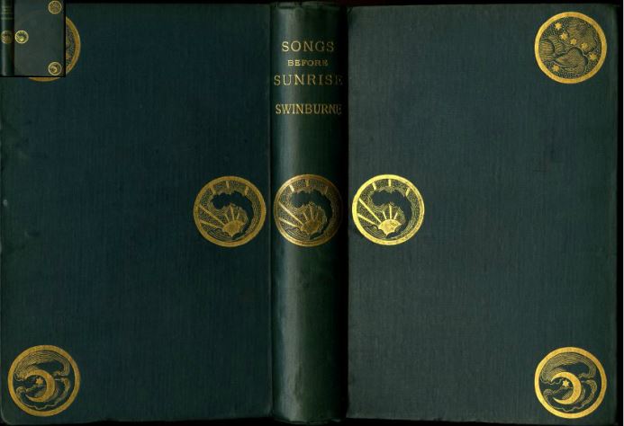 inspired Whitman’s own endpapers of a grillwork of curlicues, usually printed in gold ink. Ballads and Sonnets was particularly influential as a design and was directly imitated in Whitman’s striking 1889 design for Houghton, Mifflin’s large-paper edition of Nathaniel Hawthorne’s Marble Faun, bound in gold-stamped vellum.
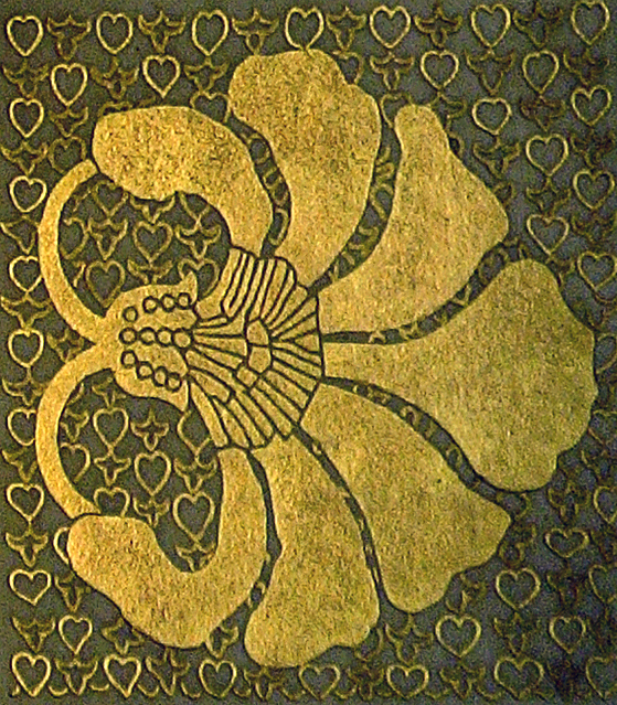
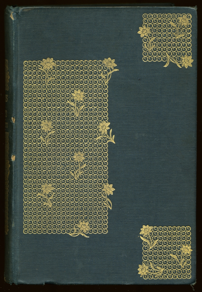 In this design, the three squares hold large stylized flowers surrounded by a grillwork of hearts and trefoils. The middle square is carried across the spine, dividing the lettering, and is repeatedon the verso. The design is stunning – sharp, clear, and powerful. Only150 copies were issued, boxed with red cloth jackets with the title stamped in gold. This was the first of a series ofvellum-bound, limited large-paper Holiday Editions that Whitman designed for Houghton, Mifflin over the next ten years. Many of her best designs were created for the Holiday Editions that the publisher issued as gift books preceding Christmas. A poster of 1895 advertising the selections show a dozen books, most of which feature her designs. Generally, these books were issued in cloth and were not limited editions, although their cost was usually greater than regular trade issues.
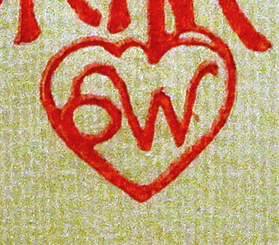
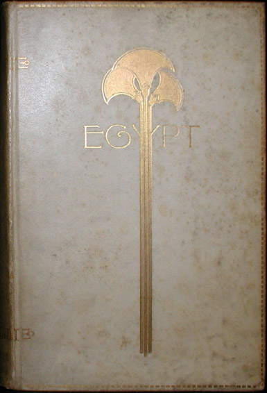
 Whitman often overlaps calligraphy and imagery, partially obscuring the lettering. Her remarkable 1899 Marble Faun design of undulating horizontal anemones, their stems wrapping around the book and connecting each volume to the next, is a tour de force. The volumes are bound in white cloth, with her signature flaming heart logo, lettering and design in gold. Likewise, a binding for Martin Brimmer, the first director of the Museum of Fine Arts in Boston and Sarah Whitman’s close friend, graces Brimmer’s three essays on the history, art and religion of ancient Egypt, published in 1891. Issued in gold-stamped vellum and blind-stamped suede, its design is nothing short of extraordinary. The lettering of the title, Egypt, is overlaid by three stylized papyrus plants representing the Nile river and delta.
If imitation is the sincerest form of flattery, Sarah Whitman was indeed flattered by many imitations. The lack of a definitive list of her works (although the list published in Sue Allen and Charles Gullans, Decorated Cloth in America (UCLA, 1994), is an excellent start) complicates identification. The great majority of her books was for Houghton, Mifflin, who, recognizing their high commercial value, themselves imitated her work and produced books that are in her style. There is no firm evidence that she designed books for D. Lothrop, Dodd, Mead, Cupples and Hurd, Lamson, Wolffe, or T. Y. Crowell, who all produced books 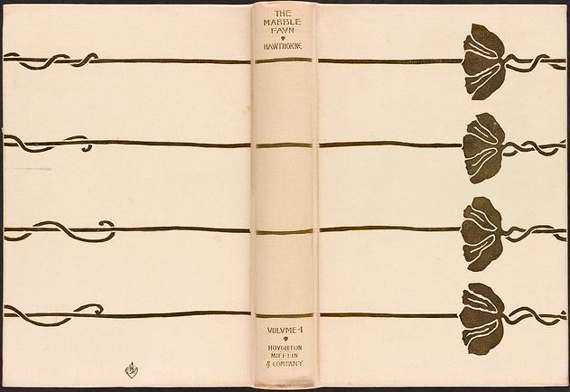 strongly resembling Whitman’s models. Roberts Brothers, who published her first confirmed design, published several other books designed by her until 1895, most of these written by Susan Coolidge. But though she represented the face of modernism at the start of her career, Whitman’s work was eclipsed by the popularity of the so-called poster style fifteen years later, and after the late 1890s she produced few bindings.
Further Reading
Allen, Sue, Victorian Bookbindings: A Pictorial Survey (Chicago, 1976).