 Sarah Wyman Whitman’s Book Covers in Relation to Her Designs for Central Congregational Church
Many of the elements that Sarah Wyman Whitman included in her book designs are incorporated in the windows that she created for Worcester’s Central Congregational Church, her first stained glass commission. Whitman began designing for Houghton, Mifflin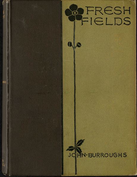 and Company in 1884, the same year the she was invited to design the church’s interior.
H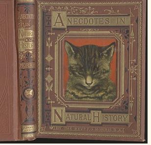 er book designs moved away from the busy style that was popular in the later half of the nineteenth-century. These earlier book covers favored spaces completely filled with image and pattern and would sometimes include reworked illustrations from within the text. Anecdotes in Natural History, for example, was a popular book written by Francis Orpen Morris for a juvenile audience and issued by G. Routledge & Sons in 1873. The cover is on terracotta colored cloth with multiple borders in orange, gold, and black Eastlake-style designs surrounding a large image of a cat. Whitman emphasized spare designs with elegant contour and asymmetry. Her cover for John Burroughs’ Fresh Fields of 1885 is very striking, with simple linear silhouettes of a single, attenuated flower intersecting with the title and author’s name. The two colors of deep olive and a lighter, muted green suggest thetheme of nature in Burroughs essays. By thoughtfully designing covers, Whitman started a new trend of simpler aesthetics in the industry, a topic explored more fully by Stuart Walker, former Book Conservator of the Boston Public Library.
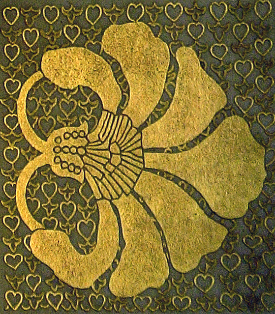
![]() Whitman’s interest in book covers as well as interior design and stained glass reflects her commitment to ideals of the Artsand Crafts Movement. Both mediums, book covers and stained glass, align with the movement’s philosophy of making quality art accessible to the masses. In Notes of an Informal Talk on Book Illustration…Given before the Boston Art Students Association, Feb. 14, 1895, Whitman described the process of designing bindings:
Whitman’s interest in book covers as well as interior design and stained glass reflects her commitment to ideals of the Artsand Crafts Movement. Both mediums, book covers and stained glass, align with the movement’s philosophy of making quality art accessible to the masses. In Notes of an Informal Talk on Book Illustration…Given before the Boston Art Students Association, Feb. 14, 1895, Whitman described the process of designing bindings:
You have got to think how to apply elements of design to these cheaply sold books; to put the touch of art on this thing that is going to be produced at a level price, which allows for no handwork, the decoration to be cut with a die, the books to out by the thousand and to be sold at a low price. . . What I feel is that under these conditions, the more necessary it is [to design covers well] because they are really like 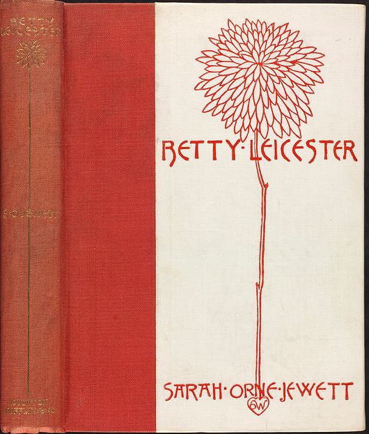 aesthetic tracts. They go everywhere. (pp. 5-6)
Whitman designed over 300 book covers for Houghton, Mifflin, a number for her close friends Sarah Orne Jewett, James Russell Lowell, and Oliver Wendell Holmes The artist would consult the authors, often including their preferences in her designs; for example, she usually included mayflowers (also known as the hawthorn) for Jewett’s covers, including Deephaven (1894), The Queen's Twin (1899), The Life of Nancy (1895), and The Country of the Pointed Firs (1896), as it was the author’s favorite flower. The artist’s friends appreciate Whitman’s attentiveness; Jewett was quite vocal in her gratitude. When in 1904 the publisher introduced a new cover for Betty Leicester, which previously had a cover by Sarah Wyman Whitman, Jewett wrote that she wanted it restored to Whitman’s 1890 “scarlet and white—for it is an ugly little book at present… very far from the beauty of Mrs. Whitman’s charming design.”(Sarah Orne Jewett Letters, ed. Richard Cary, Waterville Me: Colby College Press, [1956] 1967, p. 160).
Whitman’s stained glass and book covers are simple yet beautiful conceptions. Most of the images focus on nature, especially flowers, which she enhanced with light gold and green colors in her books. The narthex screen at Central Congregational shows drooping booms in whitish opalescent glass that evoke the forms of snowdrops. Whitman’s covers such as that for Richard Watson Gilder’s The Great Remembrance of 1893 show similar linear abstraction.
 Flowers with undulating stems and drooping petals familiar from her book designs once also appeared in wall paintings on the
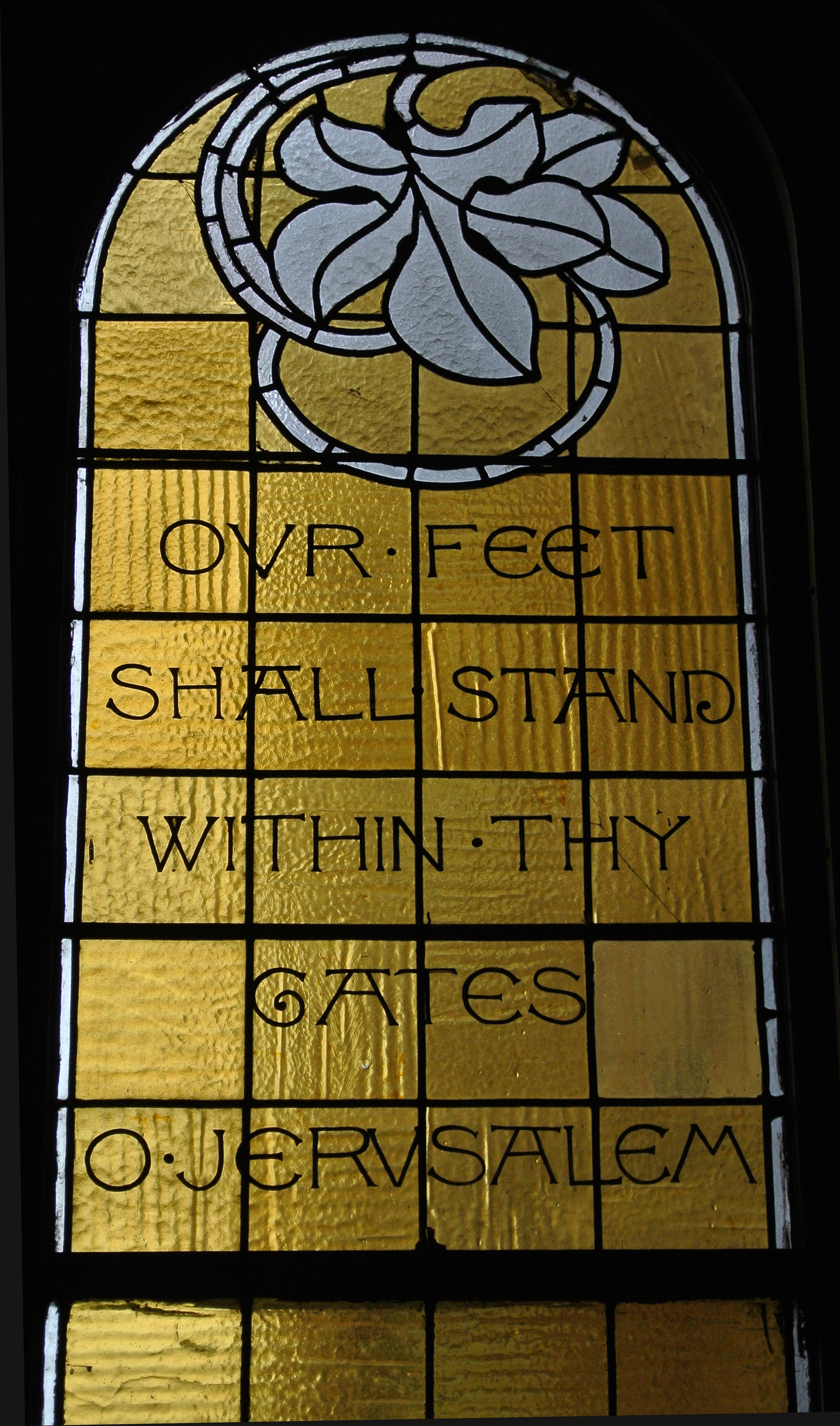 interior of Central Congregational. Sadly, the paintings are now lost. Many of the extant windows, however, also contain floral patterns that mirror Whitman’s books. The entrance windows, featuring green leaves or white leaves against a gold ground, show off Whitman’s contrasting use of color, which has become her signature.
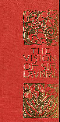
Whitman’s motifs of abstracted leaves and flowers are also mirrored in these two different mediums. Her design for James Russell Lowell’s The Vision of Sir Launfal of 1891 can be compared with the Jerusalem stained glass window in Central Congregational. Both book cover and window display leaf imagery being wrapped around by their stems, as well as Whitman’s signature font.
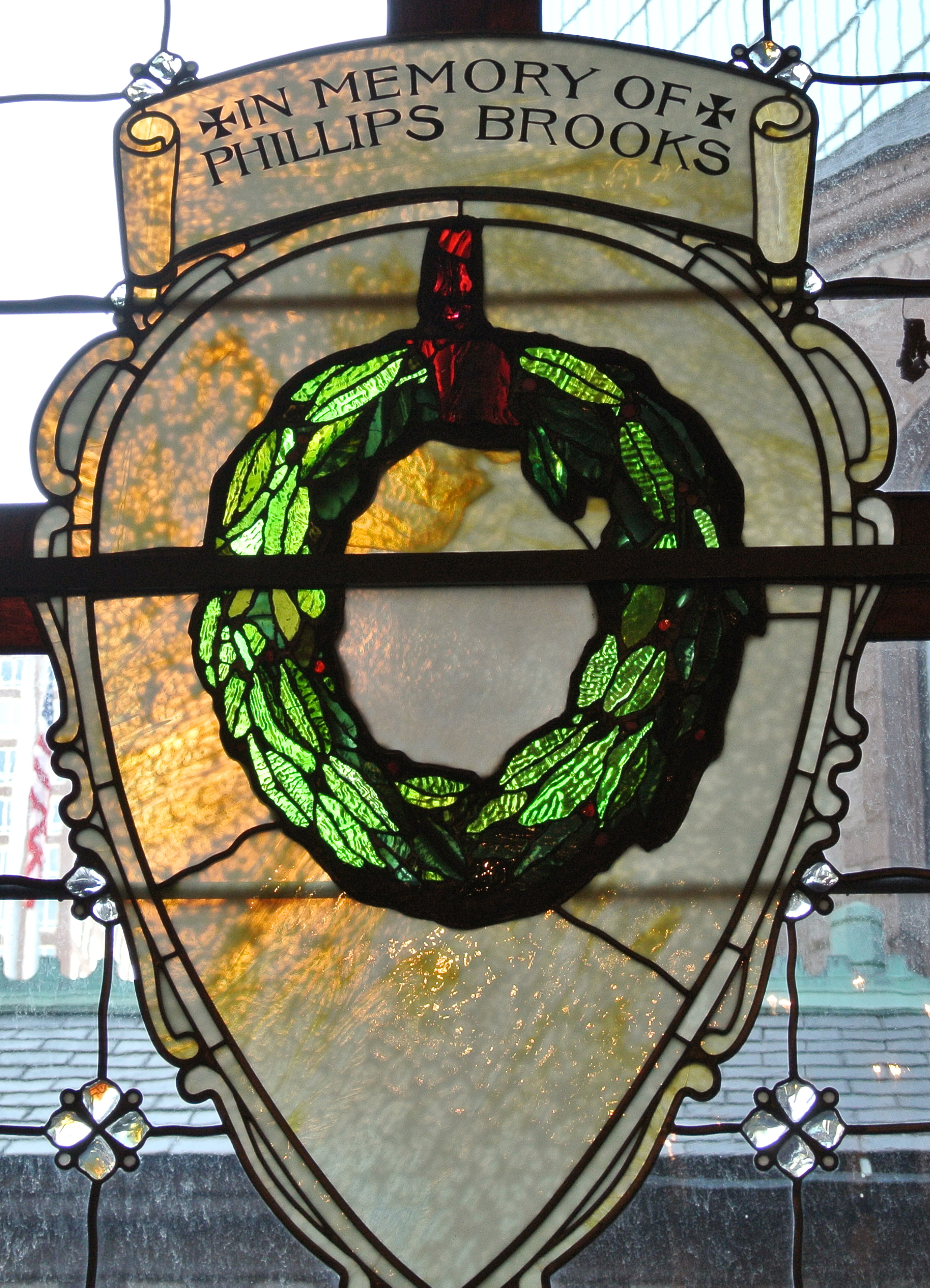
The wreath was a motif that the artist included in multiple book covers as well as stained glass installed throughout the New England area. The images vary in size and decoration, but they all capture her characteristic elegance and simplicity.
The Phillips Brooks Memorial window of 1896 at Trinity Church’s parish house in Boston features a wreath surrounded by a shield set against a lattice of small flowers. The leaves of the wreath stand out elegantly in a cleargreen glass whose light glitters against the matt tone of the opalescent beige shield. The wreath includes a red bow, which adds a sense of rich decoration to the piece. Whitman’s design for Oliver Wendell Holmes’ Birthday Book, probably of 1889, shares the Memorial window’s distinguished elegance. It is featured in the middle of the book in a rich gold color against a natural green background color. The Birthday Book wreath also features a gold ribbon, giving it a nice celebratory appearance. Another of Whitman’s wreaths is found on the 1899 cover of Betty Leicester’s Christmas by Sarah Orne Jewett. Against a warm beige background, the green wreath is graced by a delicately moving gold ribbon; a small flaming heart with Whitman’s initials appears underneath the boldly capitalized name of the author. The multiple pastel colors of the wreath give a beautiful feminine grace to the piece.
Whitman never left any element of her design unfinished. The thoughtful and personal importance of her designs is enhanced by her own unique and original 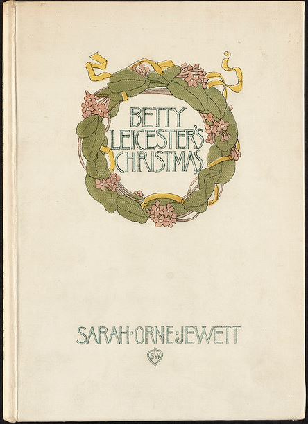 font in both her books and stained glass work. The stunning font, as reviewed above, transitions phrases
 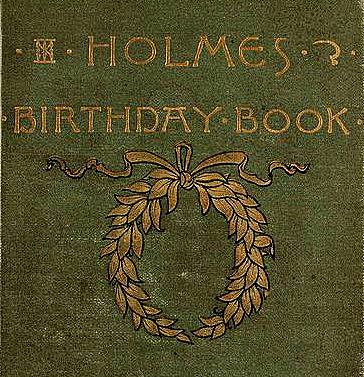 and dedications into an artistic element rather than words that distract from the visual imagery.
Boston Public Library SWW bookcovers
Further Reading:
Boston Public Library on-line resource: Sarah Wyman Whitman Bindings
https://www.flickr.com/photos/boston_public_library/sets/72157604192955355/
Bowdoin College: “Library Acquires Sarah Whitman Bookbindings,” last modified June 6, 2014,
http://community.bowdoin.edu/news/2014/06/library-acquires-sarah-whitman-bookbindings/.
O’Donnell, Anne Stewart. “Telling Books by Their Covers.” Style 1900,volume 47, pp. 47-55.
http://www.amysacker.net/documents/BookBindings_01.pdf
Smith, Betty S. “Sarah de St. Prix Wyman Whitman,” Inside SPNEA (1999),
http://hne-rs.s3.amazonaws.com/filestore/1/3/0/3/9_ca5f0cf46129094/13039_32f7c9c48723e1c.pdf.
Smith, Betty S. “Sarah Wyman Whitman: Brief Life of a Determined Artist: 1842-1904,” Harvard Magazine (2008),
http://harvardmagazine.com/2008/01/sarah-wyman-whitman.
Smith, Bonnie Hurd “Sarah Wyman Whitman,” Boston Women’s Heritage Trail, accessed November 13, 2014,
http://bwht.org/sarah-wyman-whitman/.
University of Rochester: “Beauty for Commerce: Publishers’ Bindings, 1830-1910 (includes a section on Whitman). http://www.lib.rochester.edu/index.cfm?page=3345
University of Wisconsin: “Publishers’ Bindings Online, 1850-1930: The Art of Books.” University of Wisconsin Digital Collections. 2011. 2014.http://digicoll.library.wisc.edu/WEBZ/
FETCH?sessionid=01-64583-769571080&recno=107&resultset=2&format=F&next=html/
nffull.html&bad=errorr/
badfetch.html&&entitytoprecno+107&entitycurrecno=107&entityreturnTo=brief