LESSON ONE - The Language of Art
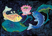
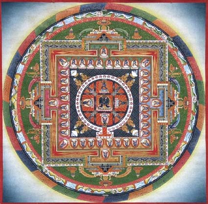
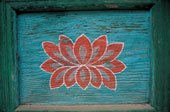
OBJECTIVE: Students will learn the vocabulary used to discuss art by utilizing one or more pieces of artwork from the Himalayan region. See Resources page for various link selections.
Expect to take three days for this lesson.
*Day one - Teacher explains and models lesson. Students research and find an art selection.
*Day two - Students identify and write down the elements and principles in their works of art.
*Day three - Students present their selections and identifications to the class.
The Elements and Principles of Design are the building blocks used to create a work of art.
The Elements of Design can be thought of as the things that make up a painting, drawing, design etc. Good or bad - all paintings will contain most of if not all, the seven elements of design.
The Principles of Design can be thought of as what we do to the elements of design. How we apply the Principles of design determines how successful we are in creating a work of art.
The Elements of Design
LINE
Line can be considered in two ways. The linear marks made with a pen or brush or the edge created when two shapes meet.
SHAPE
A shape is a self contained defined area of geometric or organic form. A positive shape in a painting automatically creates a negative shape.
DIRECTION
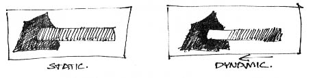
All lines have direction - Horizontal, Vertical or Oblique. Horizontal suggests calmness, stability and tranquillity. Vertical gives a feeling of balance, formality and alertness. Oblique suggests movement and action.
SIZE
Size is simply the relationship of the area occupied by one shape to that of another.
TEXTURE
Texture is the surface quality of a shape - rough, smooth, soft hard glossy etc. Texture can be physical (tactile) or visual.
COLOUR
Also called Hue. Red is a hue.
VALUE
Value is the lightness or darkness of a colour. Value is also called Tone. Pink is a value of red.
The Principles of Design
BALANCE
Balance in design is similar to balance in physics
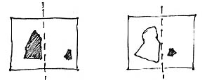
A large shape close to the center can be balanced
by a small shape close to the edge. A large light
toned shape will be balanced by a small dark toned
shape (the darker the shape the heavier it appears to be).
GRADATION
Gradation of size and direction produce linear perspective. Gradation of of colour from warm to cool and tone from dark to light produce aerial perspective. Gradation can add interest and movement to a shape. A gradation from dark to light will cause the eye to move along a shape.
REPETITION
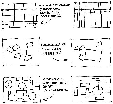
Repetiton with variation is interesting, without variation repetition can become monotonous.
CONTRAST
Contrast is the juxtaposition of opposing elements eg. opposite colours on the colour wheel - red / green, blue / orange etc. Contrast in tone or value - light / dark. Contrast in direction - horizontal / vertical.
The major contrast in a painting should be located at the center of interest. Too much contrast scattered throughout a painting can destroy unity and make a work difficult to look at. Unless a feeling of chaos and confusion are what you are seeking, it is a good idea to carefully consider where to place your areas of maximum contrast.
HARMONY
Harmony in painting is the visually satisfying effect of combining similar, related elements. eg.adjacent colours on the colour wheel, similar shapes etc.
DOMINANCE
Dominance gives a painting interest, counteracting confusion and monotony. Dominance can be applied to one or more of the elements to give emphasis
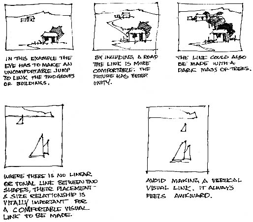
UNITY
Relating the design elements to the the idea being expressed in a painting reinforces the principal of unity.eg. a painting with an active aggressive subject would work better with a dominant oblique direction, course, rough texture, angular lines etc. whereas a quiet passive subject would benefit from horizontal lines, soft texture and less tonal contrast.
Unity in a painting also refers to the visual linking of various elements of the work.
 |